May 6th, 2026
Jessica Roberts (Principal Investigator) shares about the project: Air Pollution Visualizations for Promoting Data Literacy with Middle Schoolers and the Public (NSF #2314109).
What is your project’s big idea and what inspired you to start this project?
We believe that data visualization literacy skills can provide sensemaking tools to students for understanding complex environmental data like air pollution, while simultaneously air quality—as a familiar but complex data set—can provide rich content and motivation for improving data literacy skills. We are exploring how the development of these two skills can synergistically support each other toward the aim of empowering students to use data to tell stories about their own communities and environments.
How did you conduct outreach with the communities you worked with? OR How did you build trust with the community members that you worked with?
We recruit a local middle school science teacher for this project. The teacher then recruits students from their school to participate in the summer camp and works as a liaison between the research team and the students, their families, and the school.
Can you share a story about your participants’ learnings/experience around Building Data Literacy through Hands-On Activities?
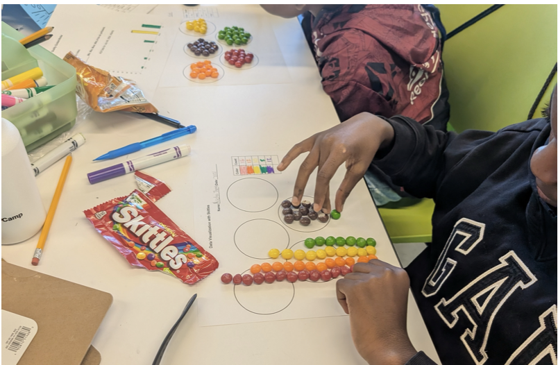
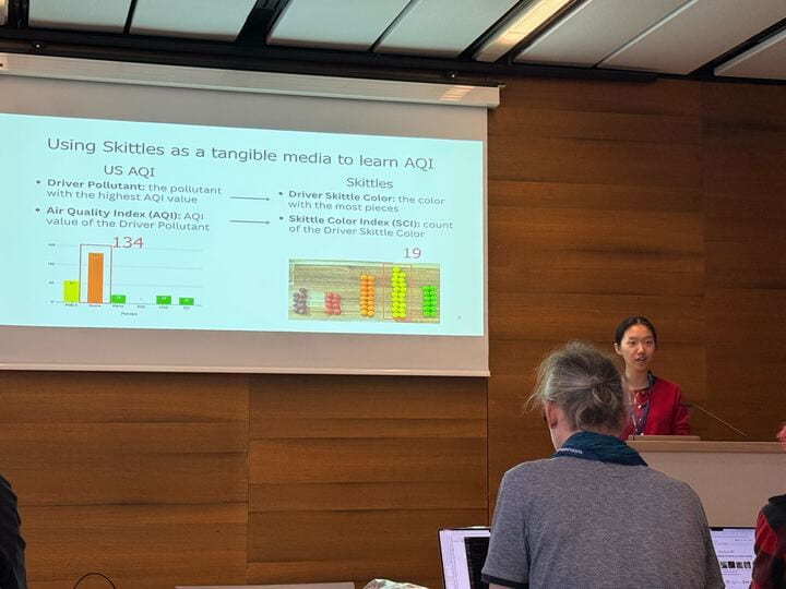
One of the key concepts we want to convey to students is the role of human decision making in data practices. The Skittles Color Index activity asks students to count and graph colored candies in their bags, as a set up for understanding the air quality index. While most Skittles are uniform in size and shape, anomalies do show up, such as double candies fused together or smaller than normal. In one running of this activity, three students in different groups had irregular Skittles, and they each handled them differently: one counted it as a normal whole Skittle; one counted a small Skittle as .5, and the third removed it from the dataset by eating it. This provided a very concrete example to discuss with the class about data decisions.
What recommendations do you have for those who want to do similar work and/or collaborate with similar audiences?
The great thing about working with data is that it’s everywhere, so it’s a matter of finding activities and content that will resonate with our learners. The teachers have been critical for this – they have been able to tell us some of the specific community issues (e.g. streetlights out) that students are already aware of, and since they know many of the students already they can help us come up with hooks that will get the students interested.
What outcomes did your project find?
As we head into the final year of our summer camp, we have seen evidence of students improving in their ability to design and critique data visualizations and ask questions about data over the course of the two-week camp.
What is a challenge you encountered in your project? How did you overcome it?
There are several frameworks for teaching vis design to college students, but the terminology doesn’t match our middle school audience. In our first year of the project, we worked with middle school teachers to create the Domain, Purpose, Visual (DPV) Framework to use in the camp. It conveys vis design concepts in terms our students understand. The persistently challenging term, however, has been “conventions” – trying to help learners keep their audience’s expectations in mind (e.g. to a U.S. audience, red is negative or hot while green is positive and blue is cold). We are constantly looking for more examples and reminding the teacher to call out conventions explicitly in visualizations they use in their class to help students remember the term and (more importantly) remember to follow the conventions of their domain.
References
1Y. Li, A. Endert and J. Roberts, “Teaching Air Quality and Data Visualization Using Tangible Models for Middle Schoolers,” 2025 IEEE VIS Workshop on Visualization Education, Literacy, and Activities (EduVIS), Vienna, Austria, 2025, pp. 27-32, doi: 10.1109/EduVIS69391.2025.00008.