- About REVISE
- Our Mission
- Our Vision
- About Our Logo
- Contact Us
In 2023 we set out on this rebranding journey to develop a new look that honors our mission to Reimagine Equity and Values in Informal STEM Education (REVISE). After a series of collaborative brainstorming sessions, concept iterations, and thoughtful refinements, we achieved a look that speaks to our mission and resonates powerfully.
Our new look leverages a mix of color and metaphors, drawing inspiration from the very essence of the REVISE Center—dialogic change in the Informal STEM Education field; organic growth and expansion; dynamic and connected. We’ve also woven multicultural representation into our color palette, celebrating the diversity that defines our team and the ISE community. Additionally, the contrast of our primary brand colors is strategically curated for visual accessibility. Our chosen sans-serif typefaces and fonts offer clean, straightforward lines for ease of legibility.
Take a look behind the REVISE logo in the graphic below, where we reveal details around the inspiration that shaped our visual branding.
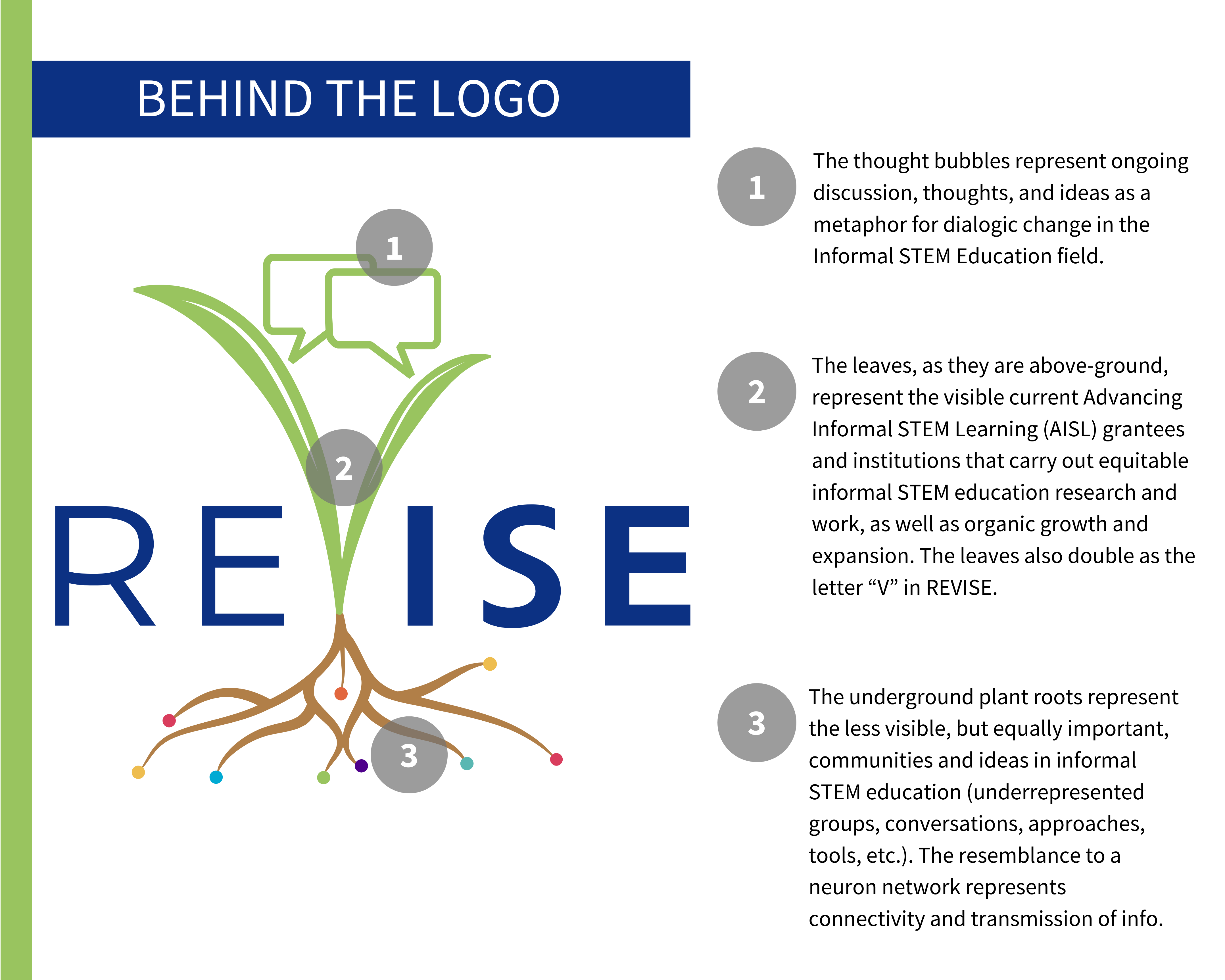
- The thought bubbles represent ongoing discussion, thoughts, and ideas as a metaphor for dialogic change in the Informal STEM Education field.
- The leaves, as they are above-ground, represent the visible Advancing Informal STEM Learning (AISL) grantees and institutions that carry out equitable informal STEM education research and work, as well as organic growth and expansion. The leaves also double as the letter “V” in REVISE.
- The underground plant roots represent the less visible, but equally important, communities and ideas in informal STEM education (underrepresented groups, conversations, approaches, tools, etc.). The resemblance to a neuron network represents connectivity and transmission of info.
Recommended alternative-text:
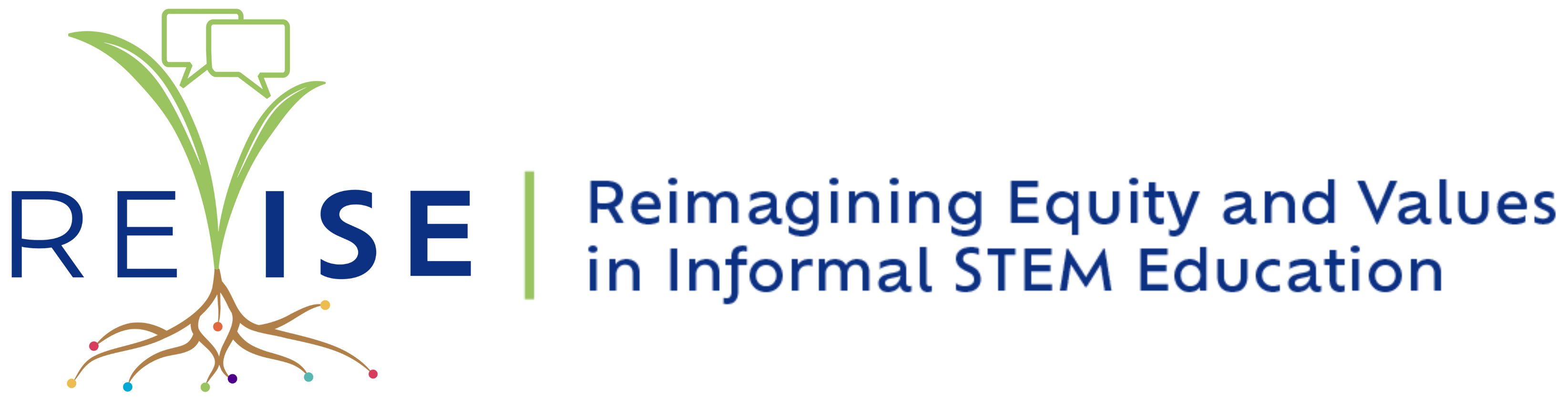
REVISE logo: plant with speech bubbles on it. Dark blue text on white background: ‘REVISE’.